
Background
Apex Chiropractic is a clinic owned by Dr. Zak Bissani and is the new branding proposed by my team for this project. Formerly known as Grand Terrace Chiropractic, Dr. Zak approached us about his vision, his current market, and his future plans for his clinic. The project spanned a total of 10 weeks in which my team and I researched and analyzed the local competition and the target market.
My main duty was to lead the project's art direction for both company's brand and advertisements. My responsibilities was to design a brand image, advertisements that the clinic will use on the selected mediums, and to guide team member's designs to be on brand with the new image of the clinic.
Apex Chiropractic
Graphic Design
Art Director
Branding
Ten Weeks
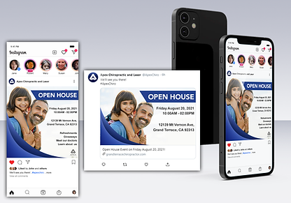
Social Media Posts
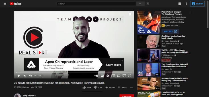
Digital Advertisements
Company Logo
Business Cards
Project
Team Members
My Role
Project Duration
My Deliverables
Advertising
Stephen Sian
Megan Stewart
Rexon De Leon II
Dalia Ortega
Denise Mongiello
The Target Market


During our research and analysis, we concluded that the target market for the clinic are men and women between the ages of 20 to 55 that live in Southern California. These individuals are preferably athletes, bodybuilders, parents, college students, or manual labor workers who make an annual income of at least $50,000.


Psychographics for the target market include, family oriented individuals that value health and fitness with an appreciation for natural alternatives.
Competitive Analysis


Both Cheeley and Blue Mountain Chiropractic were the main competitors for Apex due to their location being relatively close to Apex Chiropractic. There were many similarities in terms of services offered, however the main difference that separated Apex from its competition was Class IV Laser Therapy.
It was noted that Apex was the only chiropractic clinic that offered laser therapy in all of Southern California and that it was the main selling point along with Dr. Bisanni's years of training, individualized approach to patients, and the clinic's fast wait time.
Logo Ideation

I made several sketches of what the new logo for the company could look like with suggestions from other team mates. I asked for opinions and critiques for the logo in order to not stray from the image of a medical or health brand. Afterwards, I gathered the group members to narrow down the number of our choices to at least five. Out of those five choices, the third sketch was chosen as the best fit for the company.
With the logo finally chosen, I got to work on vectorizing the logo in Adobe Illustrator and made two variations for a light and dark background as well as created the logotype to pair with the mark. Here you will see the initial sketch and a vectorized variation of the logomark that is for a dark background.


Brand Colors & Final Logo


Initially, the brand colors were green, white and blue for the company, however Dr. Zak and my team discussed the matter regarding the colors that would represent the brand.
The colors chosen were shades, tints, and tones of royal blue with black and white as the second and third option. Here you can see three examples of the logomark being used by itself enclosed in a circular background using the blue color that was chosen during our discussion with Dr. Zak.
Below are the final logos with the logomark and type.


Deliverables


